Saturday 22 October 2011

Camera envy

I'm not a hugely social person in general, but when it comes to photography, I am probably more social than I otherwise am. I have a photobuddy I shoot a lot of gigs with, and I go on regular photowalks with up to 100 people at a time (which is a few too many people, I feel!). But also when it's not planned, you often find yourself interacting with other photographers, even if it's wordlessly. When you're shooting gigs on your own, you see the same old faces also there with their cameras, trying to get some good shots. You share a few words, you check out their photos on Flickr afterwards. I went to take pictures of the aftermath of the Clapham Junction riots a few months ago, and I was unsurprised to find that I was not the only photographer there. And of course, when you go to touristy places, whether it be the London Eye pretty much on my doorstep, or to far-flung countries, obviously photography is a large part of that experience... people want to remember what they've seen and done. In all of these photographer-interactions, one of the most frustrating things is camera envy!


Obviously, some of the equipment people have you can scornfully deride, but when you see Canon users walking around with their L glass, and Nikon users with their gold-banded 24-120mms, there's always that little twang of jealousy. At gigs, particularly, when you see photographers with their 70-200mm f/2.8 lenses, costing a grand or more, knowing that they're going to be getting pin-sharp images at large distances, it makes you a little ashamed to be screwing on your miniscule, plastic telephoto that cost a mere £300. What is infinitely worse is seeing people walking around on holiday with £5,000 of equipment around their necks taking photos of everything, non-stop. And what is infinitely worse than that is people walking around with £5,000 of equipment around their necks taking photos of buildings with the pop-up flash on. Arggg!

So what should we do in this situation, to ease the frustration? Three options spring to mind:

  • Mug the unfortunate photographer for their equipment, and put it to use for the power of good (photography). This is unlikely to end well, even if you do disguise yourself as a disgruntled local.
  • Claw pitifully at the photographer's leg, sobbing, asking them to have mercy on your £500 kit and give you a go of their pro glass.
  • Of course, the only realistic option is to take the moral high ground, and remind yourself that excellent pictures can be taken on mediocre equipment. This is clearly true, as a quick search of Flickr will tell you (did you know that you can search Flickr by camera make and model?). Get to know your equipment like the back of your hand -- know where all the buttons and functions are, and what they do, get a feel for how it exposes, and how long it takes to respond to your press of the shutter release. Trust me, that will be more valuable to you than the camera around the other guy's neck. Of course, if you have the opportunity to upgrade your gear, go for it. Just remember that it's the photographer that makes the picture, not the equipment.


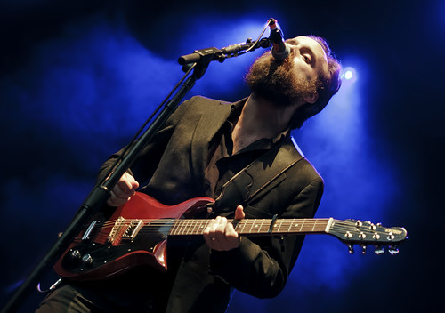
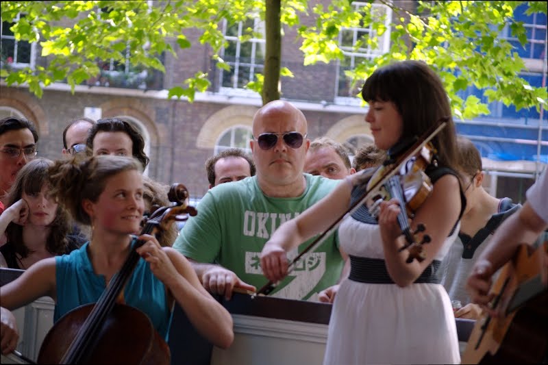
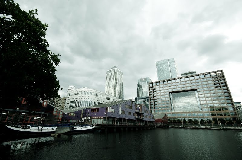
A couple of travel photos taken with mediocre equipment (standing next to people with $$$ gear)

Sunday 25 September 2011

That's me in the corner

The title of this post is a little homage to one of the best bands ever, R.E.M., who announced that they were retiring this week, but the subject of this post is backgrounds, because the background of a photo can be as important as the subject or the foreground. In fact, the background of a photo can make or break a photo. I'm sure we've all seen pictures of people with palm trees or Afro-like hedges coming out of their heads, or l'enfants pis relieving themselves over the unsuspecting photo subject. Sometimes there are people in the background with weird facial expressions or doing distracting things, or there's just someone in the corner when you don't really want there to be. Pretty frustrating! Sometimes you can save things with a delicate application of Photoshop, but most of the time it's best to get things right in camera, because they can't be saved. We saw in a previous post that sometimes if you get things even a little wrong, the background can get a little invasive!

Aside from being a negative influence, a good background can be an amazingly positive thing. Check out the above image of Elena Tonra, who goes by the stage name of Daughter. Those lights in the background give a real atmosphere to the shot. For me, they give the impression of being searing heat lamps beating down on poor Elena, who is wilting a little under their oppressive rays. Imagine if they weren't there... how ordinary a picture would that be?

Yawn! In this case I changed my shooting angle (I was shooting quite low here) in order to get the lights in the frame, and that's something I've learnt to do as my experience has grown... use the background elements when you can. Especially when you've shooting live music, using the stage lighting really boosts the impact of the picture. As well as using lights, you can also use other band members as interesting backgrounds, as in this image of the band Peggy Sue:

Using the background in this way gives a greater depth to the image, and increases the amount of time you want to spend looking at an image. Always a good thing! Besides using backgrounds to add impact and to add depth, backgrounds can also add context. If you see a street scene with the Eiffel Tower peeking over the rooftops, you automatically think: Paris! If you see the Hollywood sign on the hills in the background, you think Los Angeles... and this needn't be specific to location: backgrounds can give information on all sorts of things, from weather/season to what event is happening to what mood or emotion is pervading. Particularly when you're shooting photos on a professional level, or you're hoping to sell your photos to a company or sponsor, it can be useful to include their logo or advertising in the background too... but not so much so that it dominates your subject:

So the main points here, are: when you're taking a photograph, look at the background and make sure there are no distracting elements. That's probably the most important thing, and the most frustrating thing if you get it wrong. If your background is distraction-free, then use the background to your advantage! Move yourself so that the background can add impact, re-frame the shot so that elements in the background add depth, and finally, use the information in your background location to add context to your photograph. If you can do all that, you'll have an excellent photograph regardless of the subject.

Sunday 18 September 2011

How much wonk is too much?

One fairly frustrating thing for me when I'm photographing musicians is that they're not expressive enough. Often their lyrics say a lot, but their expressions and bodies say very little. Largely I shoot folky-type performers, and they are decidedly less expressive than, say, rock stars. And, sadly, the lighting setups for folk acts are often poor in comparison to their rock brothers'. So, to add a little dynamism I like to add a little wonk, and this is a common-used technique, which shows it works. For instance:
IronandWine31
(Photo of Iron and Wine by Auteurian on Flickr)
However, you can certainly over-cook it with adding the wonk, as my top image shows. The rule of thumb here is: If you naturally want to turn your head when you're looking at a photo, then you have bad wonk. But you'll also see that the musicians in the top photo (from a band called Eyes & No Eyes) and the Iron and Wine photo are at the same angle to the vertical... so wonk also depends on the picture. In most cases if you're heading towards an angle of 45° then you're getting perilously close to too much wonk. It helps if the focal point of your photo is higher if you have a lot of wonk... so, in the Iron and Wine photo, the guitarist's face is towards the top of the image; in my photo of Eyes & No Eyes, the focal point is Marcus' face (the guy in the white shirt), which is low in the frame, which adds to the feeling of seasickness, of being off balance.
So I managed to correct the issue by reducing the wonk (now only 30°) and moving the focal point up in the frame (to Tristram's face). Notice also now there's a nice line (perpendicular to the line of the bodies) between Marcus' eyes and Tristram's eyes, which also helps the composition.

One final thing about wonk... it's also really great for squeezing more into the frame, by utilising the diagonal. Rather than be restricted to landscape orientation (usually meaning you have to cut off somebody's legs) or portrait orientation (usually meaning you have to cut off parts of someone's guitar), using the diagonal means reducing the negatives of both options:

Of course, I've been talking about gig photography here, but adding wonk also works in other forms of photography. Just remember: don't overdo it!

Saturday 13 August 2011

Noise is a killer

Anybody know what the picture above is of? I'm not sure I could guess if I didn't know already. It's someone's eye. In fact, it's the eye of a musician who goes by the name Shura, but you can't really tell it's an eye at all. There's a lot of smearing which means that detail is lost; there is lots of speckling, particularly in the shadowy areas; and although it's not too bad here, there is sometimes a lack of contrast because regions of low contrast are wiped out by the noise, which tends to be quite contrasty.


Noise is caused by the electronics of the camera (or the scanner, if you're scanning film. N.B. noise is not to be confused with film grain). A large percentage of noise comes from the sensor in your camera, and in general, the larger the sensor, the less noise in the images. This isn't the whole cause, since there's also an effect that comes from the closeness of the light-sensitive photosites on the sensor itself. In general, the large, expensive cameras will have a large sensor (often called a full-frame sensor, because it's almost the size of a frame of 35mm film). Prosumer level cameras have an APS-C size sensor, which is considerably smaller (1.5--1.7x smaller) than full frame. Most compact cameras and MSCs/CSCs (like the new Olympus Pen series) have sub-APS-C-sized sensors, and thus suffer from larger degrees of noise. Some of this noise will be cleaned up by the camera's software when it processes the image that you've taken, but some remains, especially when you have the camera set at a high ISO, that is, the sensitivity of the sensor is pumped to higher levels.


In this picture, the problem is lack of light. I'm in a dark room, I'm quite far from the stage, and the little tiny photons reflected off Shura's face aren't finding their way into the end of my lens. Here I'm shooting at 90mm on my zoom lens, with an aperture of f/4.5, a shutter speed of 1/40s, and my ISO is bumped all the way up to 6400, which is pretty much the useable limit on my camera. In fact, I'm probably shooting beyond the limits of my camera here. As a rule of thumb, your shutter speed should be faster than one over the focal length you're shooting at. So because I'm at 90mm here, I should be shooting at 1/100s to eliminate any camera shake that occurs when I take the picture. If I was to shoot at 1/100s, the picture would be underexposed because there wouldn't be enough time on the exposure to collect all the necessary photons. I could open up my aperture to make it wider (e.g., f/2.8, see diagram below), but for this lens, f/4.5 is my limit. Luckily on this lens I have vibration reduction, a system which tries to compensate for camera shake. This can often give you a 3-4 stops of light bonus, so that even though I'm shooting at 1/40s it can seem like I'm shooting at 1/320s in terms of camera shake. And this image in general is quite sharp, so I'm happy.

Is there anything that can be done about the noise in the top image? There is a little bit of rescuing that can help the situation. It depends on your post-production software (Photoshop, Lightroom, GIMP, etc.), and how adept you are at tweaking the settings, how successful this is. Personally, I'm pretty useless at this. I use a stand-alone piece of software which is called Neat Image. You select a region in the photo where there's no drastic colour change, and it analyses that region and removes the noise from the whole photo depending on what it finds. It has mixed results, depending on the quality of the region you've selected, see below.

As you can see, it's done a pretty good job of removing the speckles (luminance noise) and the random blobs of blue/green/yellow/red (chroma noise). The payoff is that the image is now a lot more soft than it was before, which means that we need to sharpen the image carefully, and potentially more than we normally would for a noiseless image. But when it comes down to either taking a noisy image or taking no image at all, it's probably best to take it, and do the best you can with the noise post-production:

The difference can be seen particularly in Shura's face, the shadow areas (compare the noise top-left to bottom-right), and any areas of solid colour, for instance in the red curtain. Differences may appear be minimal on this scale (800 pixels), but when blown up they make a clear distinction between an ugly photo and a not-so-ugly one.


Sunday 7 August 2011

Lack of focus

So, the photo above isn't entirely what I mean by lack of focus, but it is an amusing example of getting the focus wrong. Here we see the lovely Emma and Becca from the band Peggy Sue sharing a moment whilst playing. It would have been a fairly nice shot if I could have placed the focus sharply on their faces, whilst throwing the crowd a little bit out of focus to give some separation in the shot. I was shooting fairly wide, at f/4.2 and a focal length of 86mm. An f/2.8 would have given me a really nice separation, but unfortunately I don't have the cash to splash on a 70-200mm f/2.8. The issue with this photograph, then, is wrong focus. I missed the focus on the young women sharing a musical moment, and instead managed to get a picture of a fierce-looking heavy-built man appearing like he's going to scale that barrier and give me a punch on the nose for taking his photo. The reason was that I just wasn't paying attention to my focus points. I had just been taking a photo of the lead singer in the band (her guitar is in the lower right corner) and swung around to see Becca and Emma getting into their groove, and I pressed the shutter release. Oops. I realised at the time that I'd missed the focus, changed the focus point to rest on the closest of the girls*, and snapped again... but by then the moment had passed. A missed photo opportunity. Dangit.

This is more what I'm talking about when I say "lack of focus". What we have here is a fairly reasonable picture of a famous landmark (Canary Wharf in London). It's quite dynamic, due to the radial streaks in the sky. It's quite cold in tone, which echoes the glass and chrome of the buildings, and the water. It's reasonably sharp, too. However, there's no focus to the photograph. There's nowhere for the eye to rest. What should be the focus, the main Canary Wharf tower in the centre, is too small in the frame to have an impact. It is helped slightly by the leading lines of the buildings around it focusing in on the main structure, but there's too much void -- the empty sky, the empty water -- when the building should be dominating.


The moral of this story is, then, to have a strong focal point to your photograph. Often, when you have a wideangle shot like this one, there should be some foreground interest. When you're photographing a building with a wideangle lens, however, it may be better to get in very close to it, making the most of the dramatic converging vertical lines that you'll get in that situation, and making your building fill the frame. When you don't have a wideangle shot, it can be better to place your focus on a line of intersection of thirds -- divide your shot up vertically and horizontally into three equal parts, and where the lines cross towards the four corners of your photograph, these are the "sweet spots" where your subject can sit quite comfortably. This is known as the "rule of thirds", although it should only ever be used as a guide, not as a hard-and-fast rule!


* Just a little tip: I would focus on the closer of the girls because the "region of good focus", let's say, extends more behind the focus point than it does before. As a rule of thumb, when you have your subjects at a range of distances, you should focus about 1/3 of the way into the frame. So I would focus on Emma, the girl on the right, who is slightly in front of Becca, so as to get them both into the region of good focus. If I was to focus on Becca, because the region of good focus extends less towards me, there would be a higher chance then that Emma would be out of focus. I hope that makes sense!

Introduction to Photo Phrustrations

I am a photographer. I'm not a professional, probably somewhat through lack of talent, but mostly through choice ... I don't think I'd enjoy it. Photographers are often poorly paid, and poorly respected: I like to be both well paid and well respected! However, I take a lot of photographs, and people have asked me to do "professional" jobs before -- photograph music festivals, photograph school visits, photograph weddings -- so I have some experience of photography.

Photography is continually very frustrating to me, though. There's probably not a day that goes by when I'm taking photos when I'm not thinking "Arggg, I wish I could have done that better. I wish this picture was better exposed. I wish this picture was sharper. If only I'd crouched down lower. If only I'd given the subject more space in the photo. If only I'd brought my tripod." I'm frustrated with myself, with my equipment, with the weather, with missed opportunities, with lack of post-processing skills. And I guess plenty of you are too. So perhaps we can pool our knowledge so that by sharing tips and tricks, or even just our moans, we can get more enjoyment out of our photography by discussing it.