The title of this post is a little homage to one of the best bands ever, R.E.M., who announced that they were retiring this week, but the subject of this post is backgrounds, because the background of a photo can be as important as the subject or the foreground. In fact, the background of a photo can make or break a photo. I'm sure we've all seen pictures of people with palm trees or Afro-like hedges coming out of their heads, or l'enfants pis relieving themselves over the unsuspecting photo subject. Sometimes there are people in the background with weird facial expressions or doing distracting things, or there's just someone in the corner when you don't really want there to be. Pretty frustrating! Sometimes you can save things with a delicate application of Photoshop, but most of the time it's best to get things right in camera, because they can't be saved. We saw in a previous post that sometimes if you get things even a little wrong, the background can get a little invasive!

Aside from being a negative influence, a good background can be an amazingly positive thing. Check out the above image of Elena Tonra, who goes by the stage name of Daughter. Those lights in the background give a real atmosphere to the shot. For me, they give the impression of being searing heat lamps beating down on poor Elena, who is wilting a little under their oppressive rays. Imagine if they weren't there... how ordinary a picture would that be?

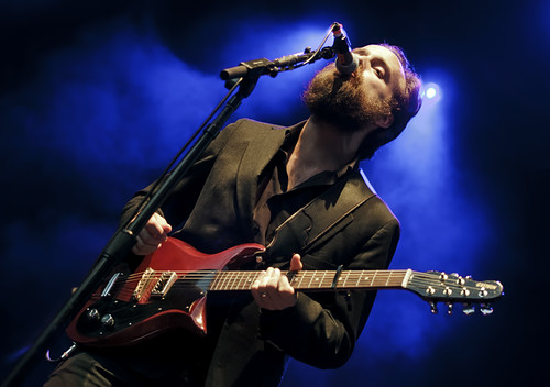
Yawn! In this case I changed my shooting angle (I was shooting quite low here) in order to get the lights in the frame, and that's something I've learnt to do as my experience has grown... use the background elements when you can. Especially when you've shooting live music, using the stage lighting really boosts the impact of the picture. As well as using lights, you can also use other band members as interesting backgrounds, as in this image of the band Peggy Sue:

Using the background in this way gives a greater depth to the image, and increases the amount of time you want to spend looking at an image. Always a good thing! Besides using backgrounds to add impact and to add depth, backgrounds can also add context. If you see a street scene with the Eiffel Tower peeking over the rooftops, you automatically think: Paris! If you see the Hollywood sign on the hills in the background, you think Los Angeles... and this needn't be specific to location: backgrounds can give information on all sorts of things, from weather/season to what event is happening to what mood or emotion is pervading. Particularly when you're shooting photos on a professional level, or you're hoping to sell your photos to a company or sponsor, it can be useful to include their logo or advertising in the background too... but not so much so that it dominates your subject:

So the main points here, are: when you're taking a photograph, look at the background and make sure there are no distracting elements. That's probably the most important thing, and the most frustrating thing if you get it wrong. If your background is distraction-free, then use the background to your advantage! Move yourself so that the background can add impact, re-frame the shot so that elements in the background add depth, and finally, use the information in your background location to add context to your photograph. If you can do all that, you'll have an excellent photograph regardless of the subject.